Guggenheim Bilbao
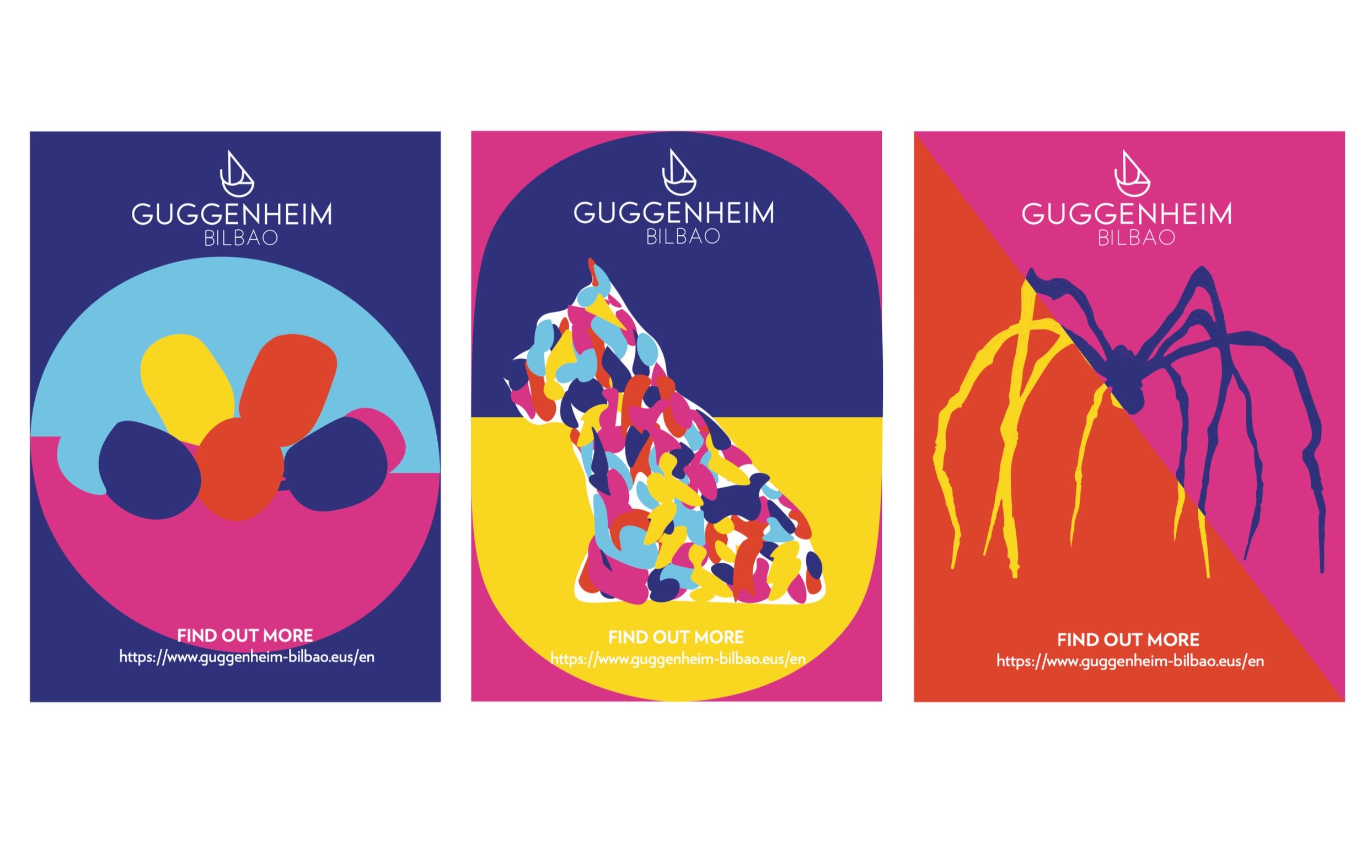
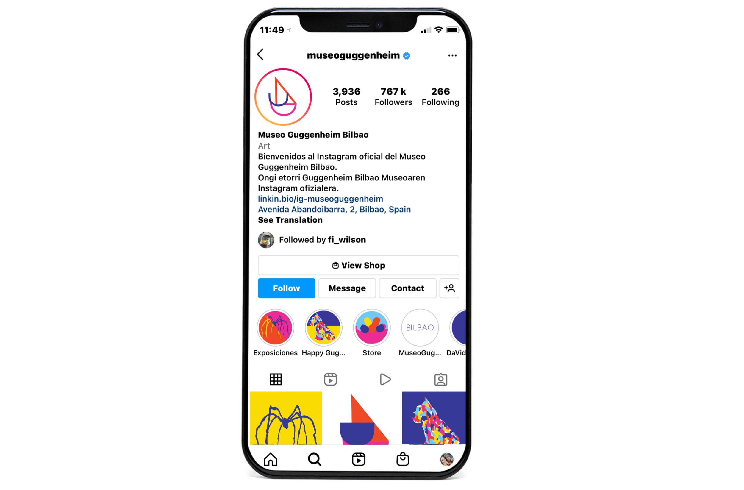
This branding assignment, The rebranding of the Guggenheim Bilbao plays a key role in adding a more contemporary element to the brand, whilst also demonstrating it’s more unique and innovative style through the use of colour. The identity maintains the same typeface throughout, using the Verlag type specifically designed for the museum’s brand. This symbol has been adapted through the unique type of the current branding, and created this ship-like structure that pays tribute to the body of water surrounding the museum with Yves Klein’s work of after The Fire Fountain. This created symbol through the type creates an adaptable frame for posters and further applications.


